History of the Logo
The logo for Transforming Sydney was created through a team effort (most of the best things are).
It started in early 2011 with the Holy Spirit giving Lilian Schmid an idea to have the 'T' and 'S' in Transforming Sydney together.
We also wanted to have the three colours of our Lord Christ Jesus: Red - Prophet, Blue - Priest, and Purple - King
(cf. Exodus and numerous other references), with "Gold refined in the fire" (cf. Rev 3:18).
As we are not graphic designers, Lilian asked our very good friend and brother Tony McLennan if he could help.
Tony in turn worked with his partner Casey Wong (and the Holy Spirit of course)
to come up with a few versions of the Logo using the 'S' over the 'T'.
After a couple of minor revisions Casey delivered the logo you see today in August 2011.
Transforming Sydney Logo

|
The 'T' represents the Cross of Calvary, and the 'S' is the purifying Holy flame of the Holy Spirit.
The Cross is Blue at the bottom representing Jesus' ministry as Rabbi (Joh 3:2) prior to His crucifixion
and our High Priest after His resurrection (of the order of Melchizedek; Heb 5:6),
and blends to Purple at the top representing His annointing as King of Israel prior to His death (Joh 12:13),
King of Kings and Lord of Lords after resurrection (1 Tim 6:15).
The flame of the Spirit is white to gold representing purity and blending to red to indicate
the prophetic inspiration and insight given by the Holy Spirit, not only to Jesus of course
but to all who submit to the Father's will.
|
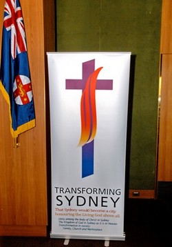
The Transforming Sydney Banner
|
The Transforming Sydney logo on the banner at the Lunch in the NSW Parliament House on
16-November-2011.
(Photo kindly donated by Ramon Williams)
|
That Sydney would become a city
honouring the Living God above all.
Unity among the body of Christ in Sydney
The Kingdom of God in Sydney as it is in Heaven
Transformation in society:
Family, Church and Marketplace
|
|
|
|